i-STAY
i-STAY is an apartment listings website where you can find rooms for rent in Ishigaki Island, Okinawa, Japan.
i-STAY
i-STAYは、沖縄県石垣島の賃貸物件が探せるマンションWebサイトです。
Objective
To promote weekly apartments in Ishigaki so that the company managing the listings there can receive inquiries and reservations from potential customers.
目的
物件を管理している会社がお客さんからの問い合わせや予約をしていただくために、石垣島のウィークリーマンションを宣伝すること
Deliverables
Design mockup (desktop and mobile)
成果物
デザインモックアップ(デスクトップおよびモバイル)
Role
UI Designer
役割
UIデザイナー
Team Members
Product manager, lead engineer, 2 engineers and the client (5 total)
チームメンバー
プロダクトマネージャー、リードエンジニア、エンジニア2名、クライアント(合計5名)
Date
November 11 - 15, 2019 (5 days)
日付
2019年11月11日〜15日(5日間)
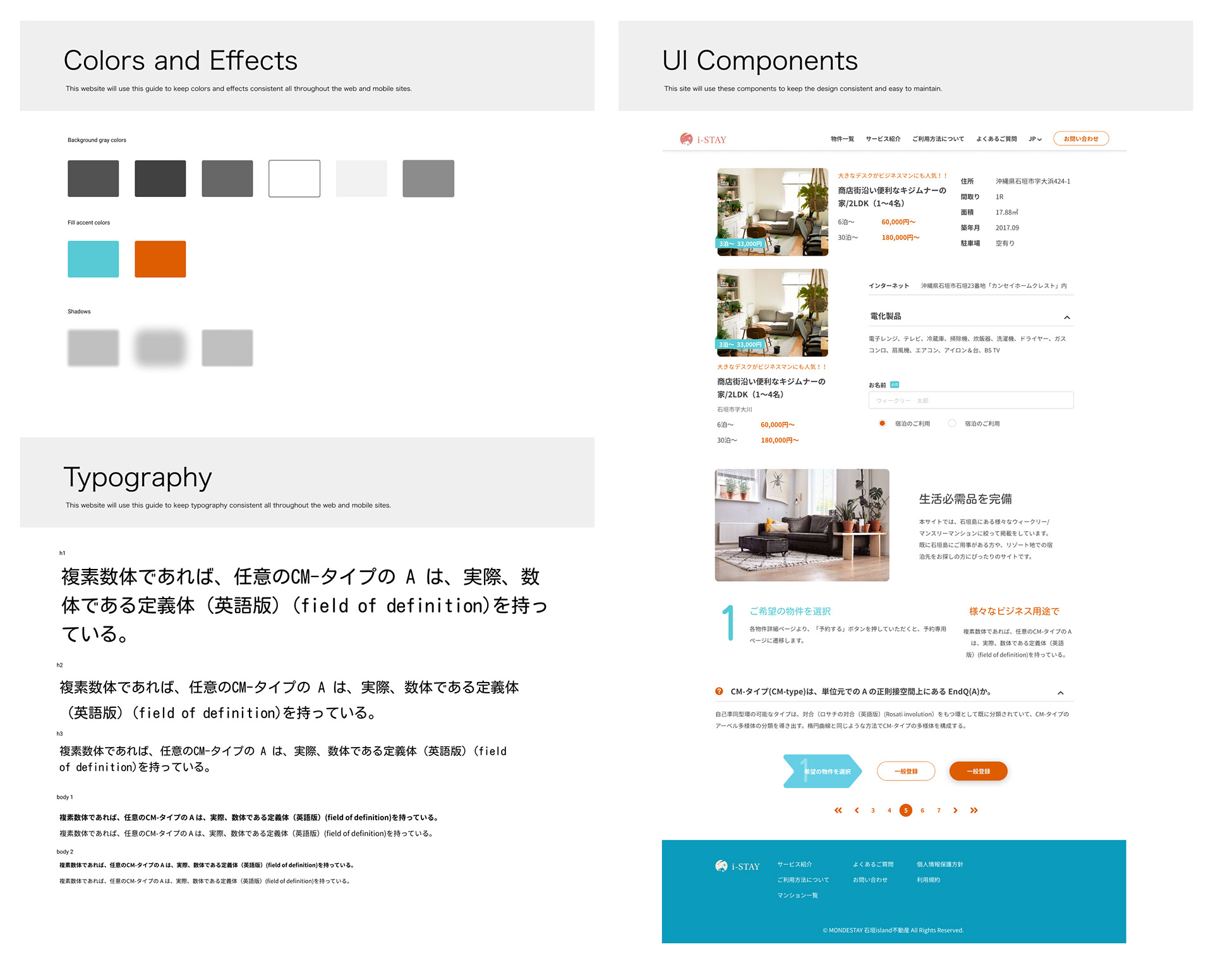
Design System
After receiving the wireframes from the product manager, I set my grid using a 4-pt grid system and Bootstrap, created local styles on Figma for typography, colors and effects. Using UI components in each page, I am able to change all instances of the component by only editing the master component in case there are changes in the design.
デザインシステム
プロダクトマネージャーからワイヤーフレームを頂いた後、4ポイントのグリッドシステムとBootstrapを使用し、グリッドを設定し、Figmaで字体や色やエフェクト等のローカルスタイルを作成しました。 各ページでUIコンポーネントを使用すると、デザインに変更があった場合、マスターコンポーネントを編集するだけで、コンポーネントのすべてのインスタンスが変更されます。
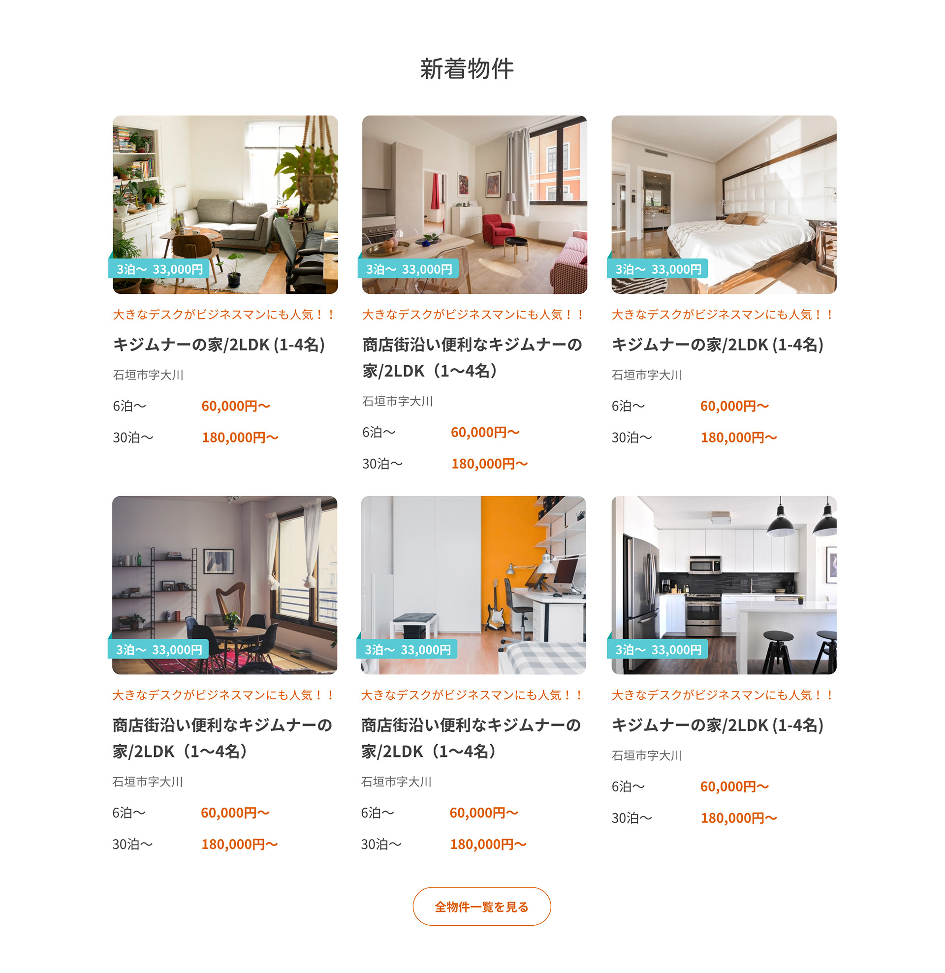
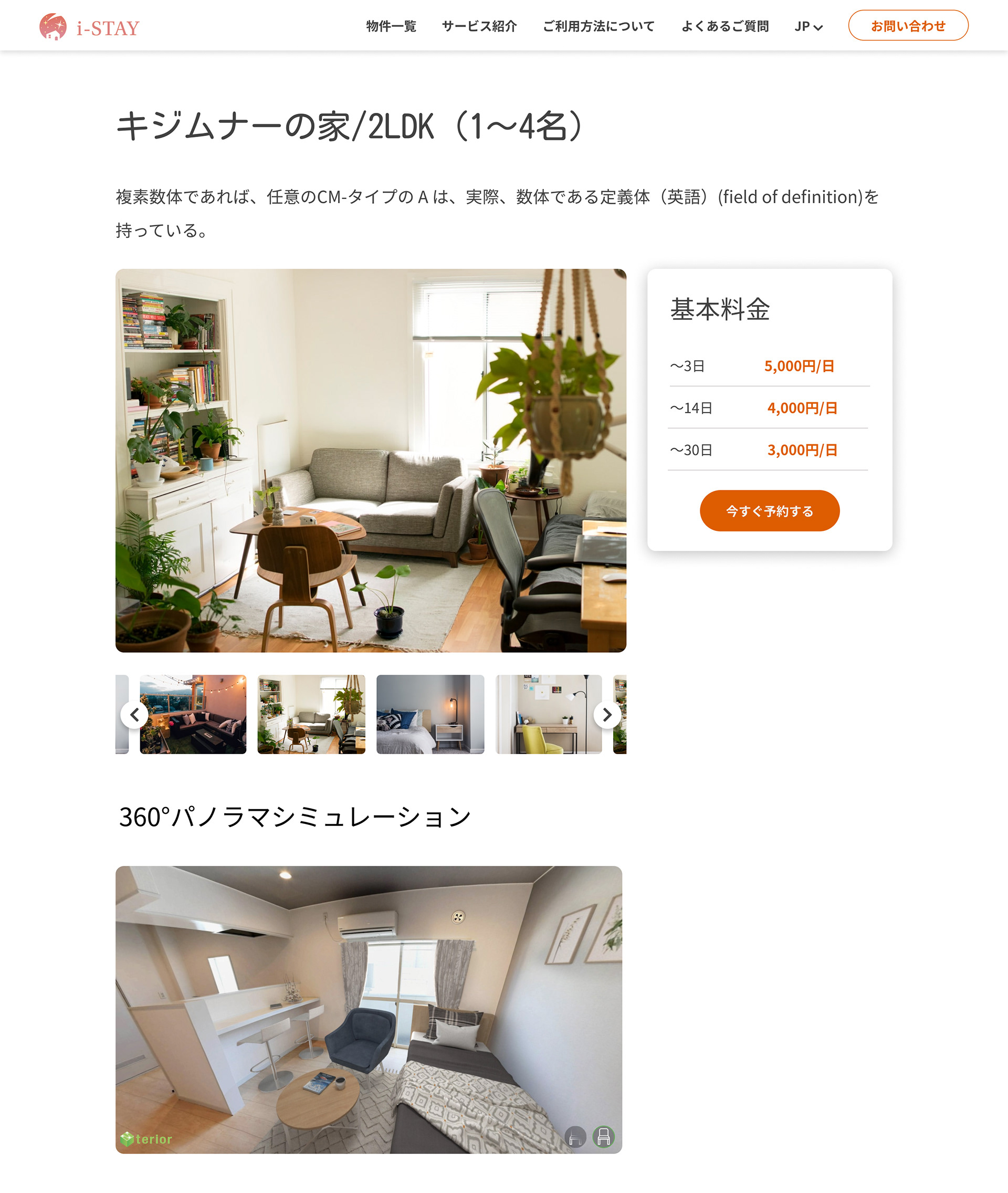
Highlighting Prices
I decided to highlight the price for 3 days like a discount tag for users to bring their attention to the most affordable listing that catches their eye.
価格の強調
ユーザーが最も手頃な物件に注目を引くために、割引タグのように3日間の価格を強調することにしました。
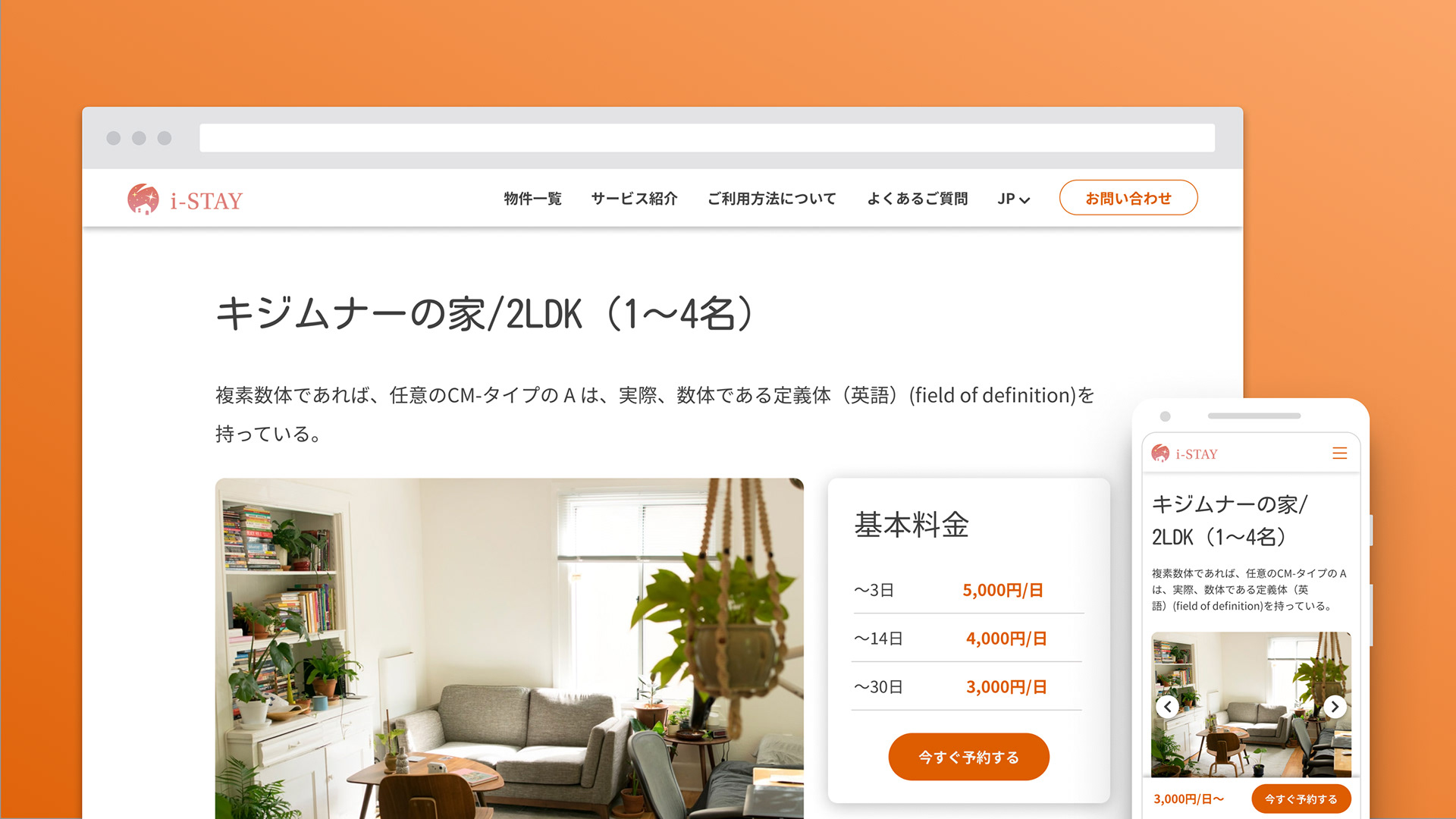
Book Now!
To ensure a good conversion rate, I used a high contrast call-to-action button on a sticky UI component on the Listing Page so users can always book a listing no matter where they are on the page.
今すぐ予約!
高いコンバージョン率を確保するために、ユーザーがページのどこでもいつでもリストを予約できるように、物件ページのスティッキーUIコンポーネントにコントラストの高いCTAボタンを適用しました。
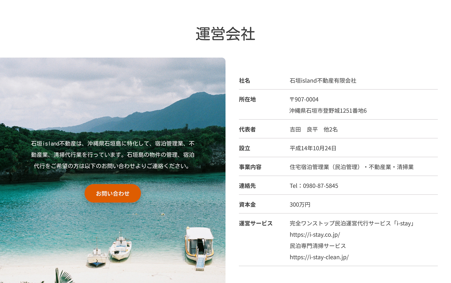
About and Contact Us
To get more inquiries, I added another CTA button in the About Us section while enticing users to visit the iconic scenery when Ishigaki comes to mind, Kabira Bay.
会社概要とお問い合わせ
問い合わせをさらに承るために、会社概要のところにもう一つのCTAボタンを追加し、石垣島といえば代表的な風景の川平湾をユーザーに興味を持っていただくようにしました。
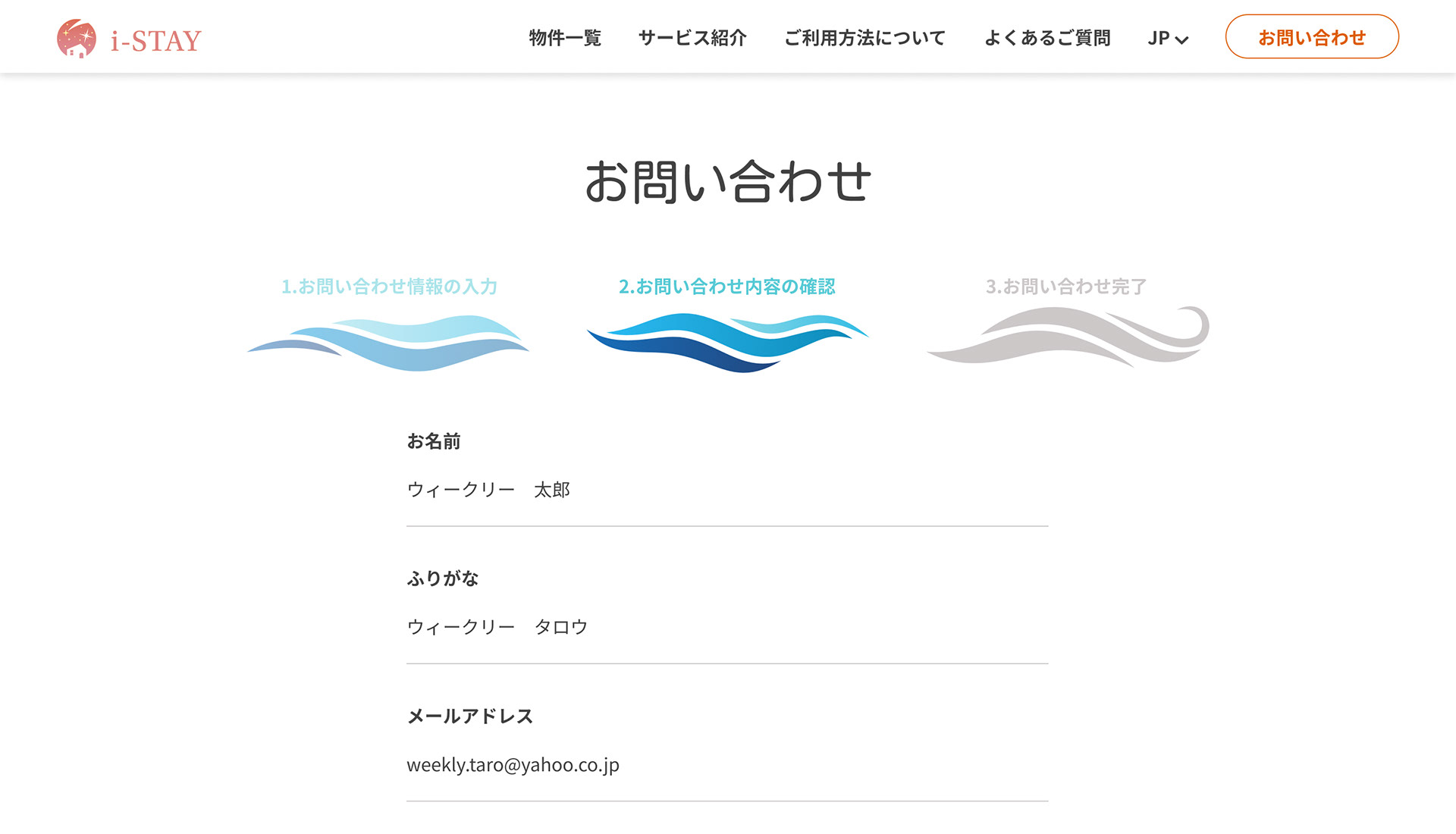
Showing Progress
I made the Contact Form into a clear step by step process for users by showing their progress when accomplishing the form.
ステップを表示
お問い合わせフォームは、フォームの入力の間に、ステップを表示することで、ユーザーにとって明確な流れにしました。
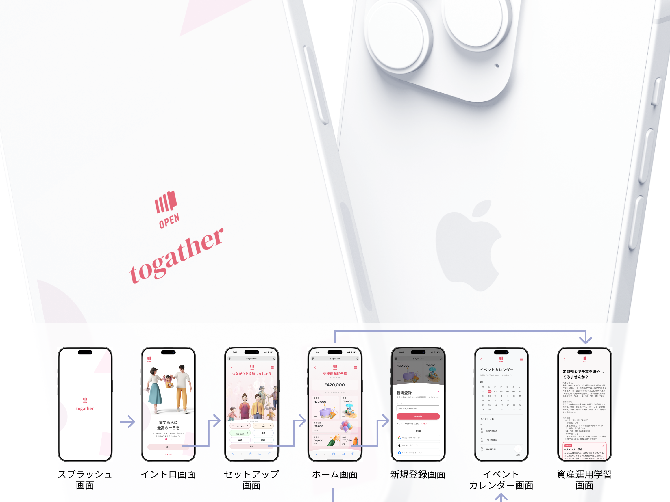
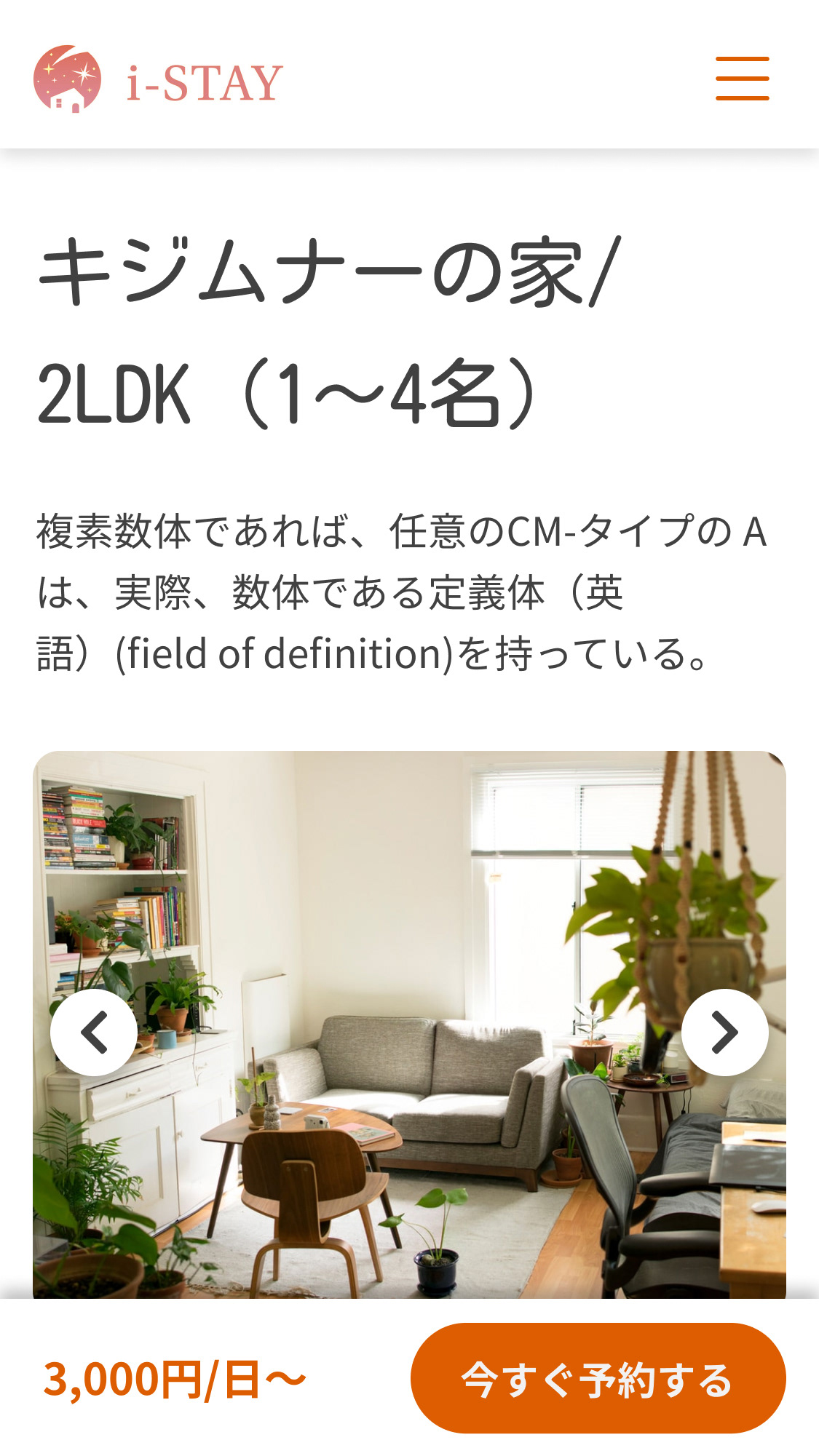
Mobile Design
You can view the mobile design below on Figma. Try different pages by pressing the left or right arrow keys or view full screen by clicking the button on the top right or pressing "F". Press "Z" to adjust the screen size.
モバイルのデザイン
モバイルのデザインを以下Figmaで見ることができます。 左か右矢印キーを押し、色んなページを見たり、右上のボタンをクリックするか「F」を押し、デザインを拡大したりしてみてください。「Z」を押して、画面のサイズを調整できます。