Project Summary
Edström Office is a sample management B2B solution from Ebisu, Tokyo in the luxury fashion and cosmetics industry. The solution helps foreign brands in Japan get PR coverage by leasing out samples to the media and tracking them from receiving the sample in Japan to returns from the media.
Problem
Staff using the old sample management solution undertook a lot of manual and redundant processes daily. This took away valuable time they can use to focus on work that truly matters and make a big impact on their job.
Outcomes
I contributed to the delivery of the solution that earned the company around 10+ million JPY in revenue. Client staff were thrilled to use the improved solution and there is a significant boost in morale within the company.
Deliverables
Interview results, user environment photos and maps, user persona, flow diagrams, design system, UI kit, journey maps, user flows, wireframes, mockups, and interactive prototypes
Team Members
Product manager, UI designer and 3 developers (6 people total)
Project Duration
6 months
Discovery Phase and Interviews
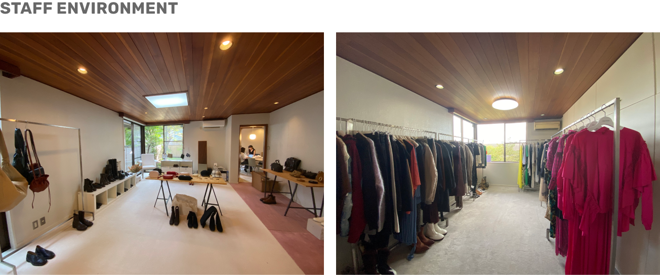
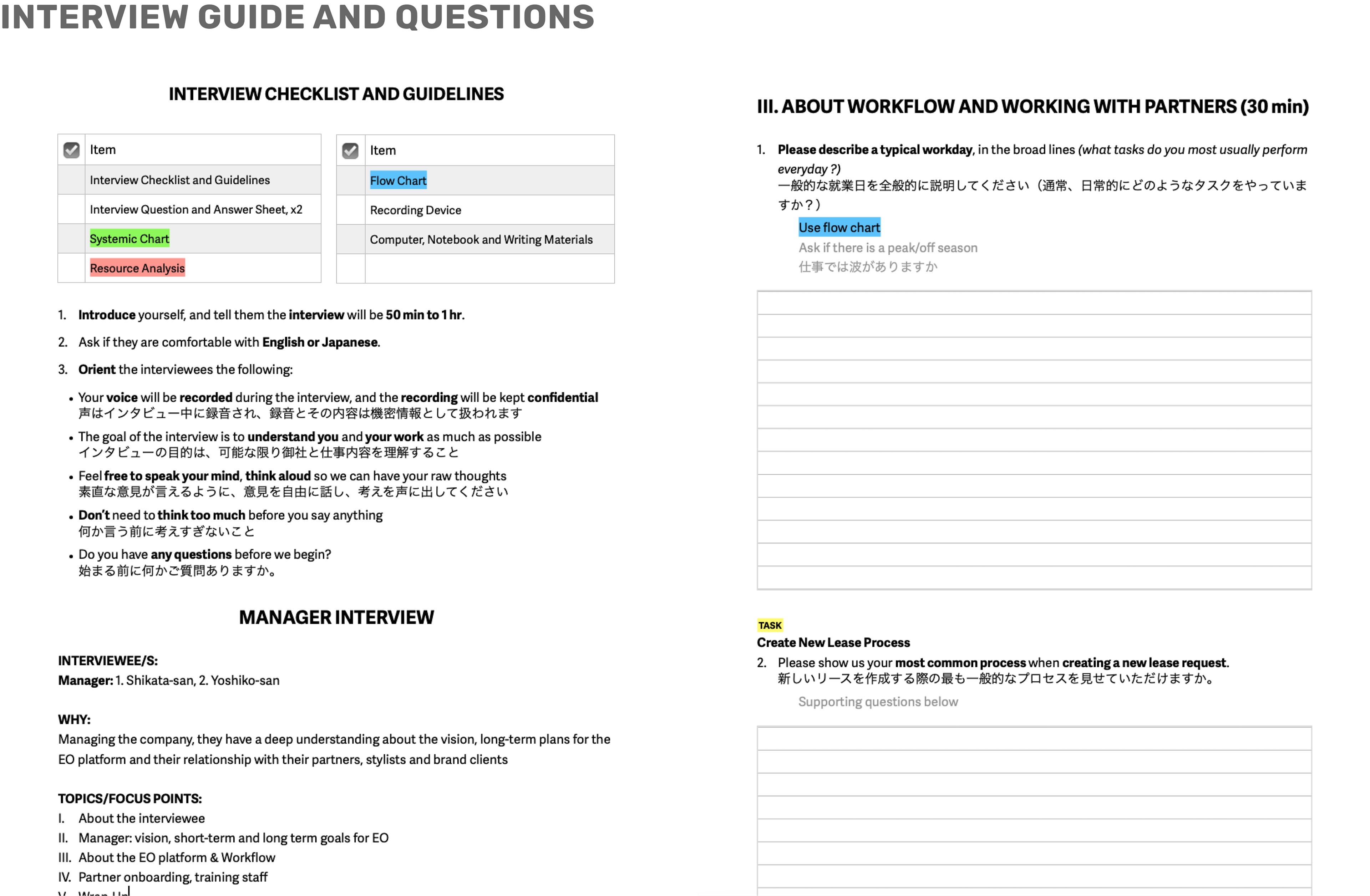
I oriented the client with the UX process and initiatives I needed their help with. Using the interview guide and questions I wrote below, I interviewed with audio recordings and tested around 10 staff and admins in Japanese at their showroom in Ebisu. I found opportunities to improve from the old solution, and grasped the environment users work in.
User Persona Key Takeaways
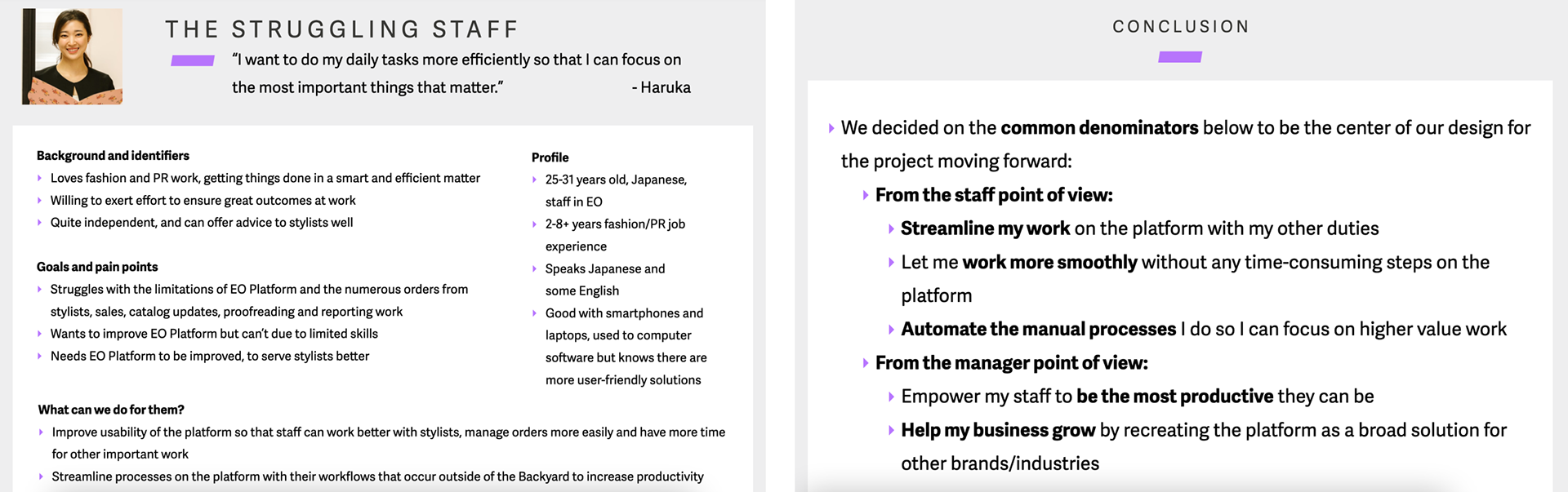
From our research, I decided to focus on the struggling staff user persona who had lots of trouble with the limitations of the old solution. I came up with principles like streamlining and automation that guided me in designing the new solution.
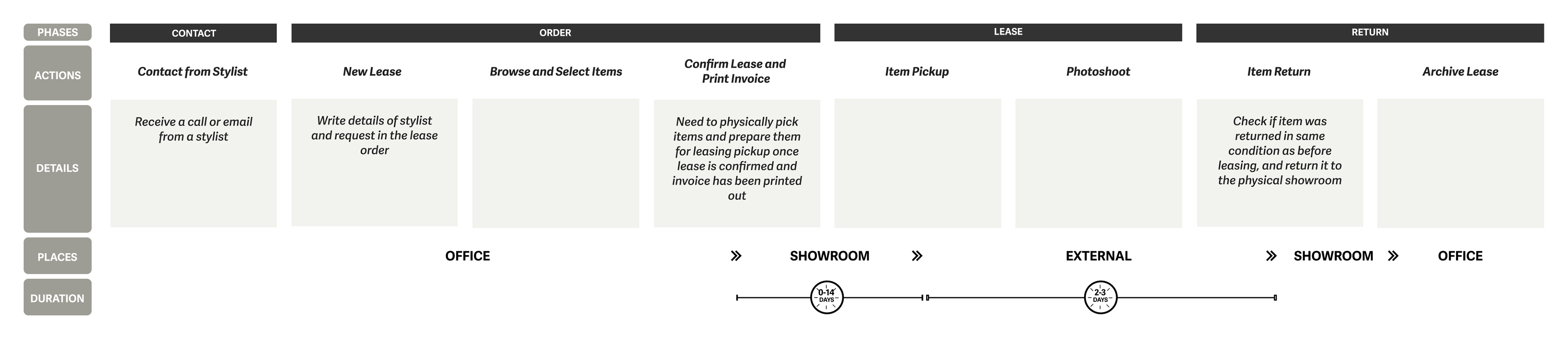
User Flow Diagram
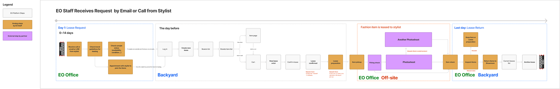
From the interviews, I summarized my findings in a diagram that shows the entire lease user flow. I had the client validate my understanding and used it as a foundation for the design of the new solution and to explicitly inform the product team.
Design System and UI Kit
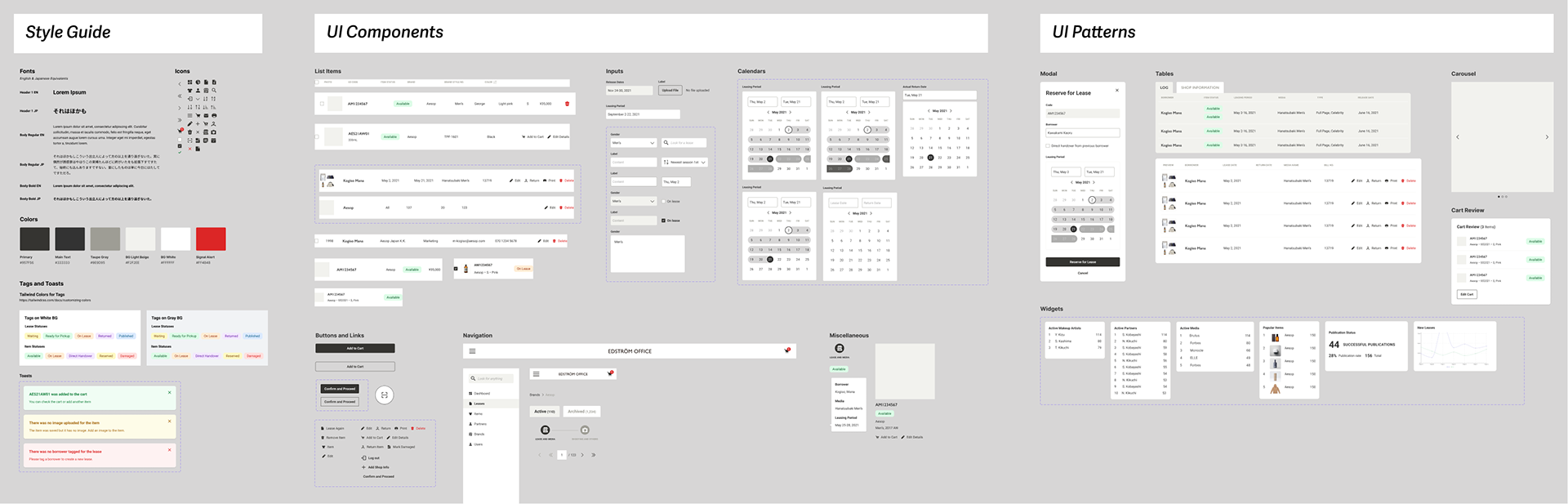
I created the design system and UI kit that served as the foundation for the design of the new solution. Since the client would want to one day license it to other companies, we decided to go with a grayscale theme.
Journey Map for Leasing and Returning
I mapped out the user journey from when staff get orders for leases until it gets returned before creating wireframes to guide me as I design the information architecture of the new solution.
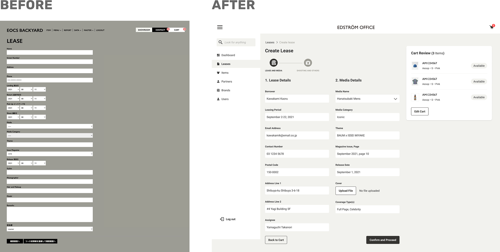
Improved Create Lease Form
The create lease form was too long, tedious and prone to errors by the staff. In the new solution, I grouped the related fields together, split the form into two steps, introduced date pickers and a cart review widget.
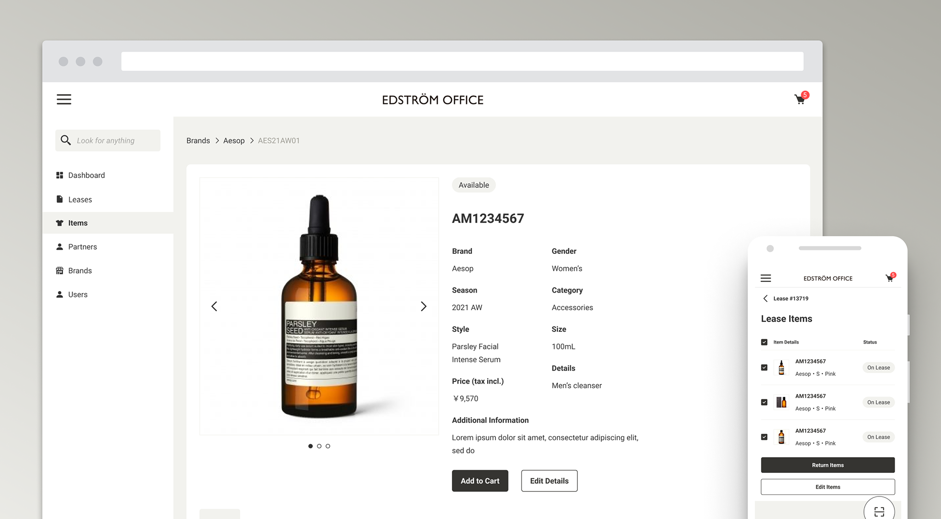
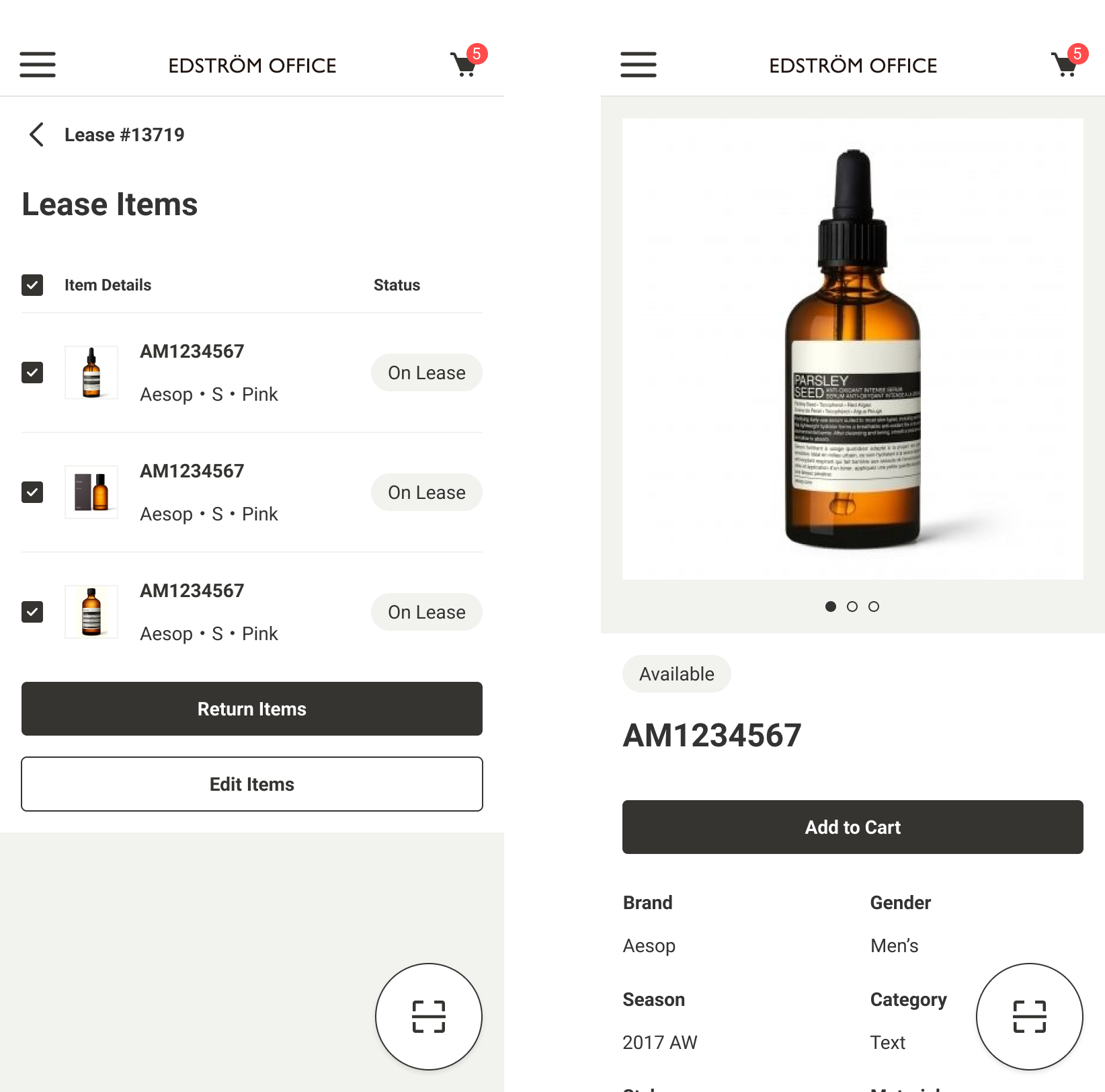
New Scanning Mobile App
Staff took a lot of time manually looking for leases and items in the old web solution. I proposed a new scanning mobile app where staff can update leases or create carts by scanning barcodes on the fly around the showroom.
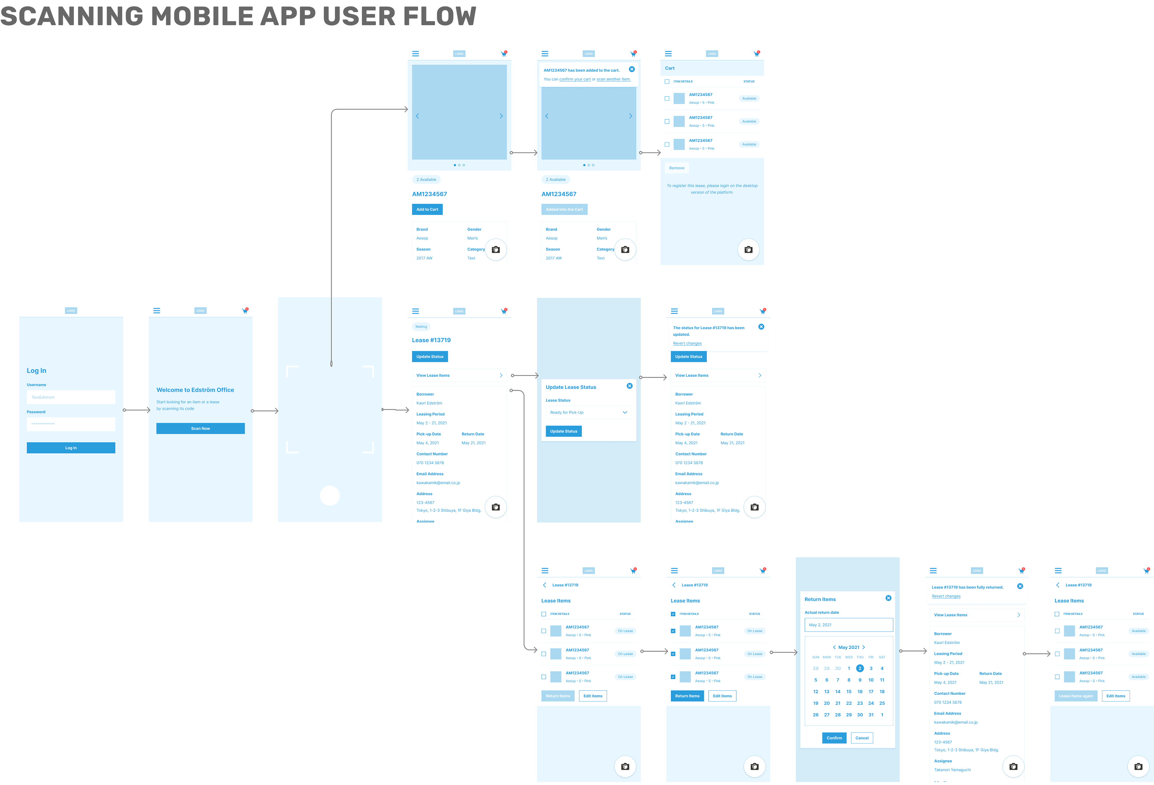
Streamlined Lease & Return Flow Prototype
I redesigned the lease and return flow and streamlined the process for the staff, after discovering how the old solution worked and the pain points they experienced with their operations on it.
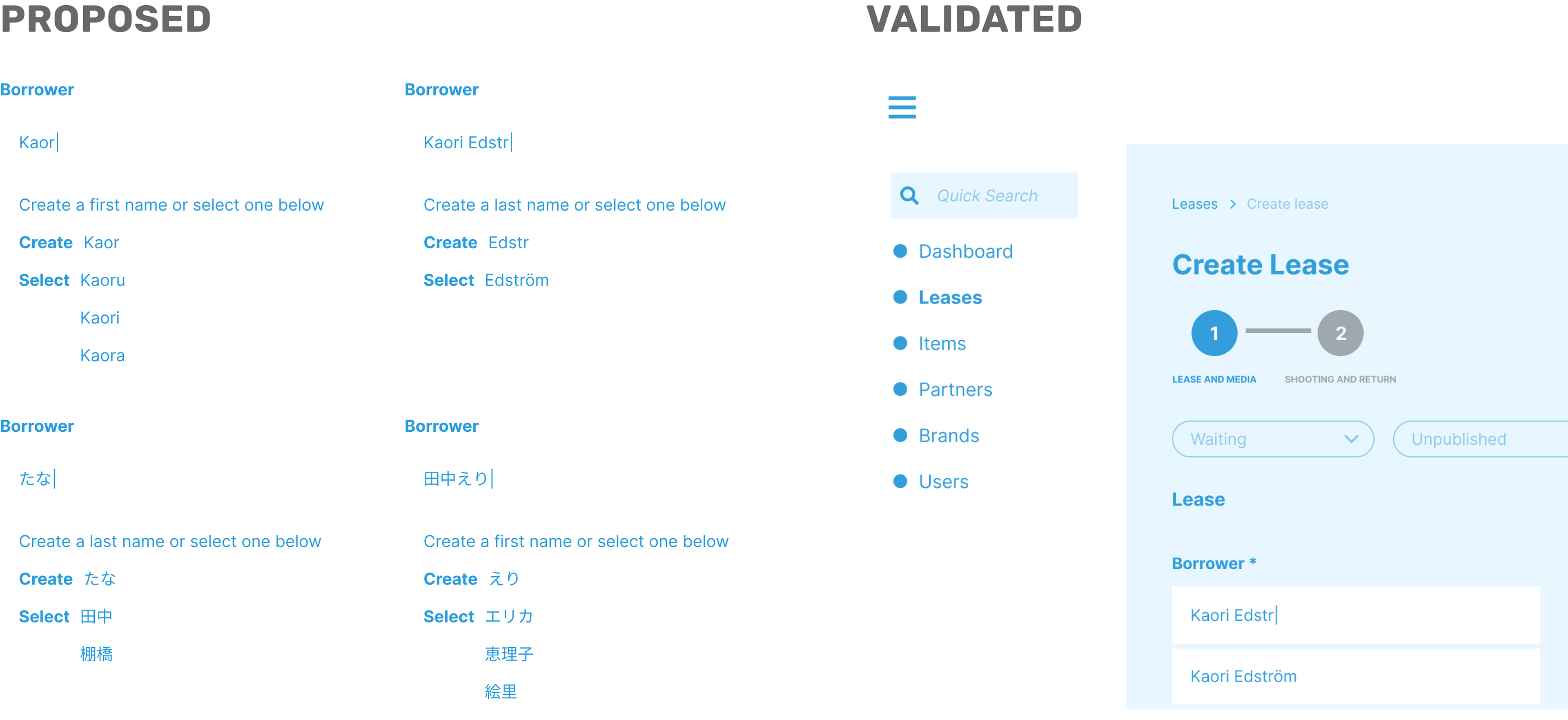
Engineering Feedback on Name Fields
Names of borrowers tagged on the old solution were not inputted in a standardized manner. I proposed a design that detects if the name typed is first or last depending on which language and order it was inputted in a field. However, this was not feasible, so we decided to just autofill names with the old database that we cleaned up.