Improving Customer and Producer Portals
For the large life insurance provider headquartered in New York, I improved the design of apps that allow their customers to purchase, check and make a claim on their insurance plans, and their producers (insurance sellers) to manage transactions with those customers online.
Deliverables
UX workshops, design system, flow diagrams, user flows, wireframes, mockups, and interactive prototypes
Role
UX Designer
Team Members
Product managers, UX design lead, UX designers, engineers, data analysts, and marketers (30 people total)
Dates
Jun 2023 - May 2024
New Addition of Producer Portal Wizard Feature
Problem: Producers or insurance sellers use many tools depending on a customer's transaction.
Opportunity: How might we streamline and simplify the workflow of producers regardless of transaction?
Solution: Create a new feature that manages all transactions in one place end to end.
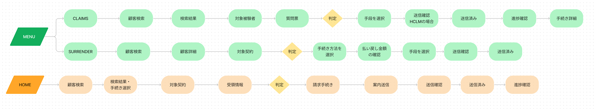
Wizard Flow Diagram
To visualize my high level design, I drew flow diagrams that illustrate how producers would proceed depending on the transaction on the new wizard feature. Each step would only have minimum cognitive load.
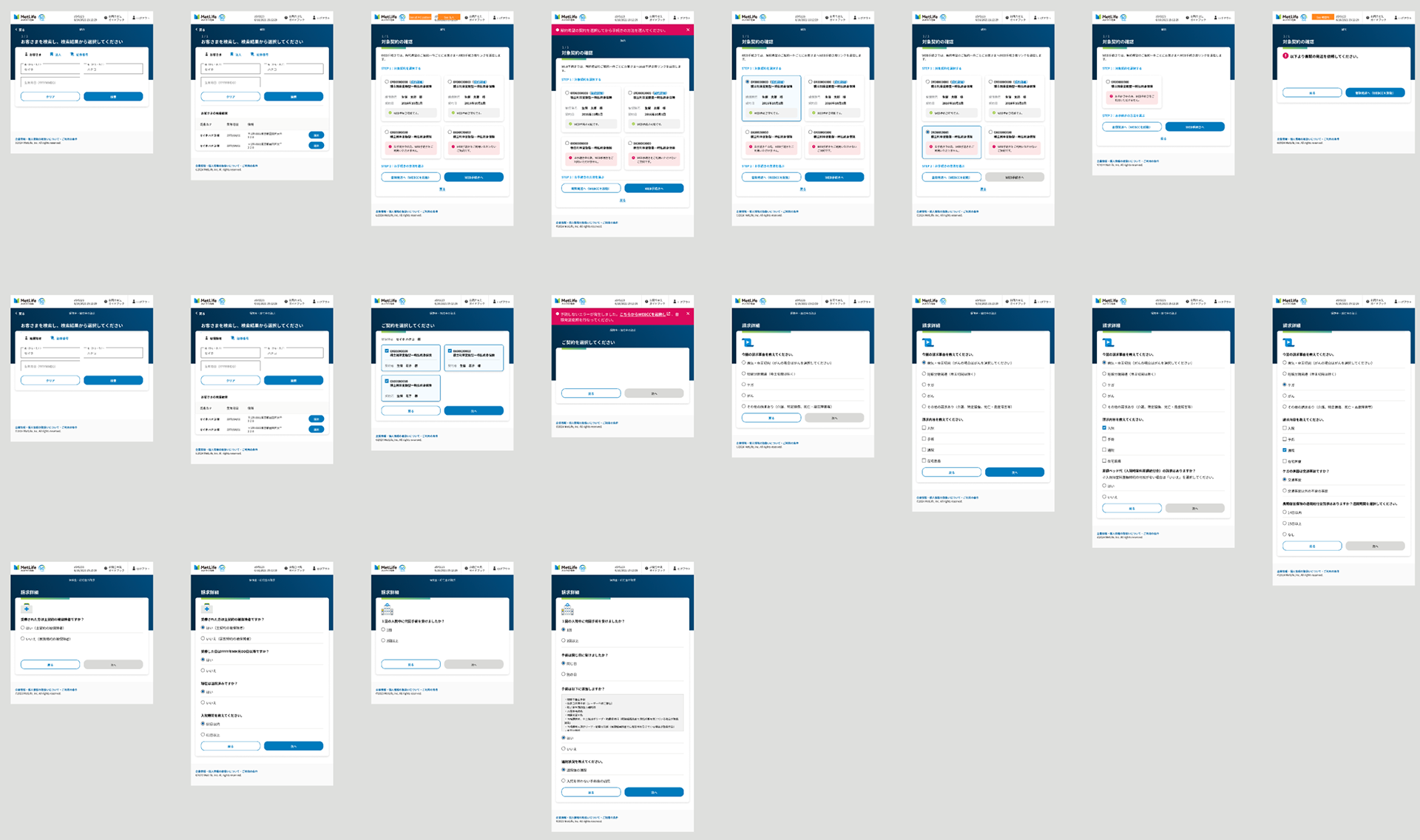
Wizard Mockup Screens
Using the current design system used in Producer Portal, I created new mockup screens for each transaction and its corner cases depending on the details from the customer. I kept elements on each screen minimal to make it simple for producers, and applied progressive disclosure on long questionnaires that gather info on the claims.
Migration of the Design System from Adobe XD to Figma
Originally, the UX design team was working on Adobe XD until the HQ in the US rolled out Figma to the Asia-Pacific region. To work more efficiently in the more powerful Figma software, I lead our design team to move the design system and assets to Figma.
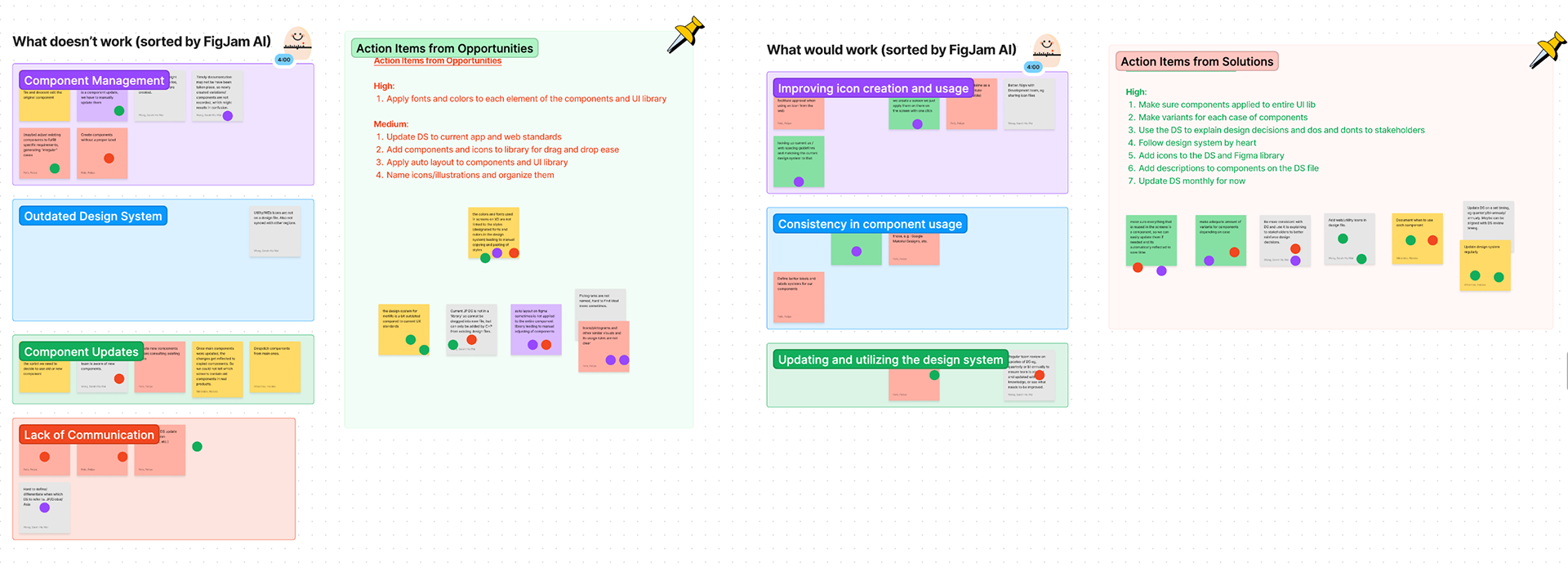
Prioritization Workshop for Figma Migration
With our current UX process and design system, we found a lot of things to be improved. I organized and facilitated a prioritization workshop to find out what problems we have, how can we solve them and which to tackle urgently as it is a good chance to improve the design system and UX process with the migration.
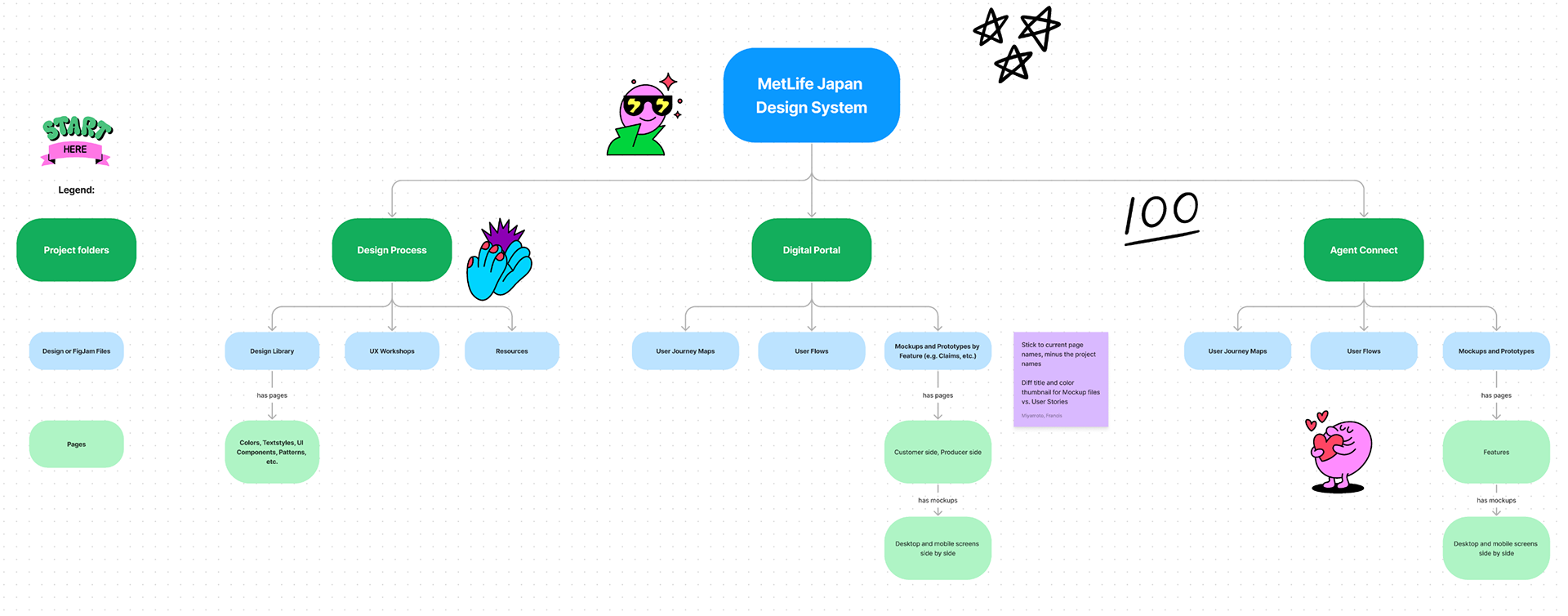
Flow Chart for Design File Organization on Figma
With priorities clearer than before, I decided on how we should store design files on Figma effectively while new user stories are initiated on a regular basis. I put my vision on FigJam, met with design and PM teams to get their feedback on the process, and based on that improved the process further.
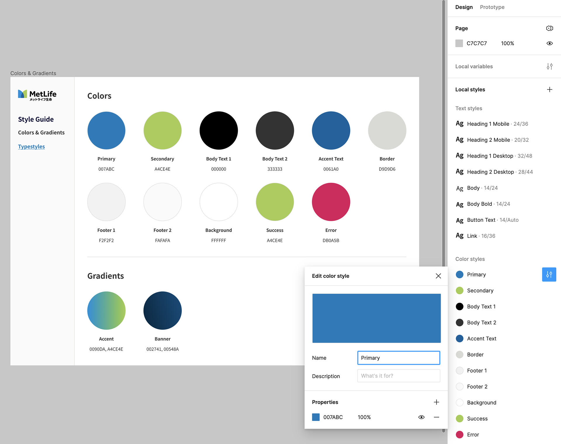
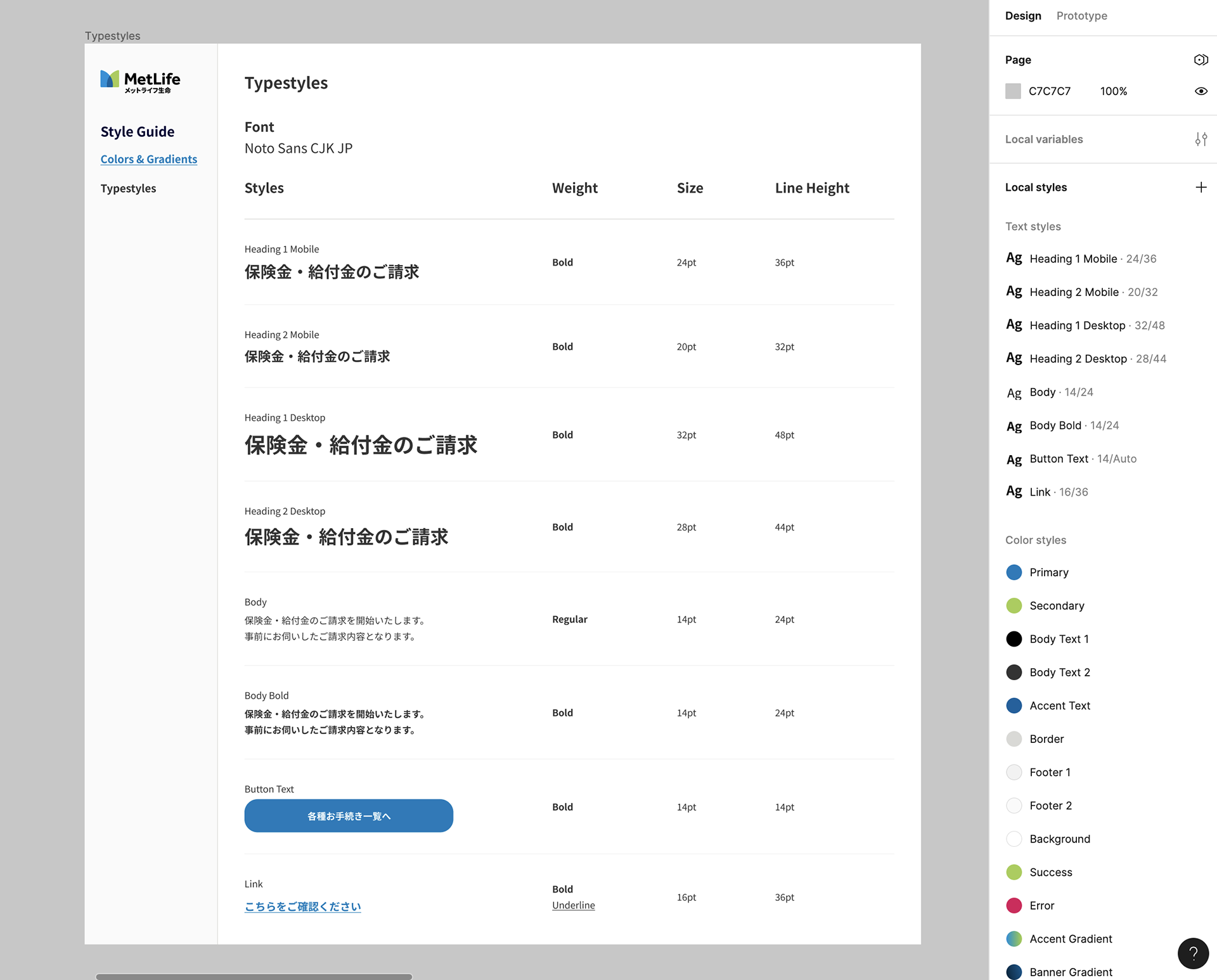
Style Guide Migration
Most of the many colors, gradients and typestyles from the global style guide are not used in our apps. I decided to simplify our style guide and set it up on Figma so that the UX team can quickly pick and efficiently apply styles.
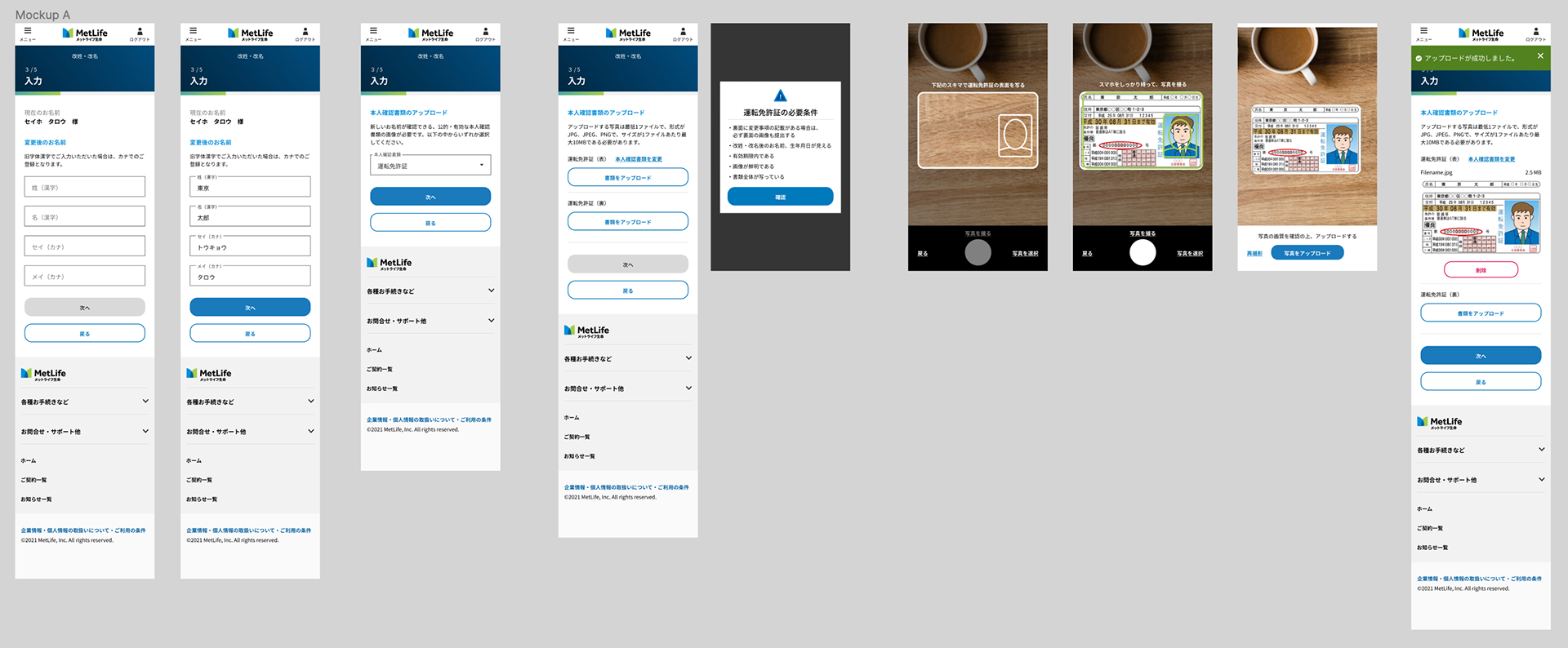
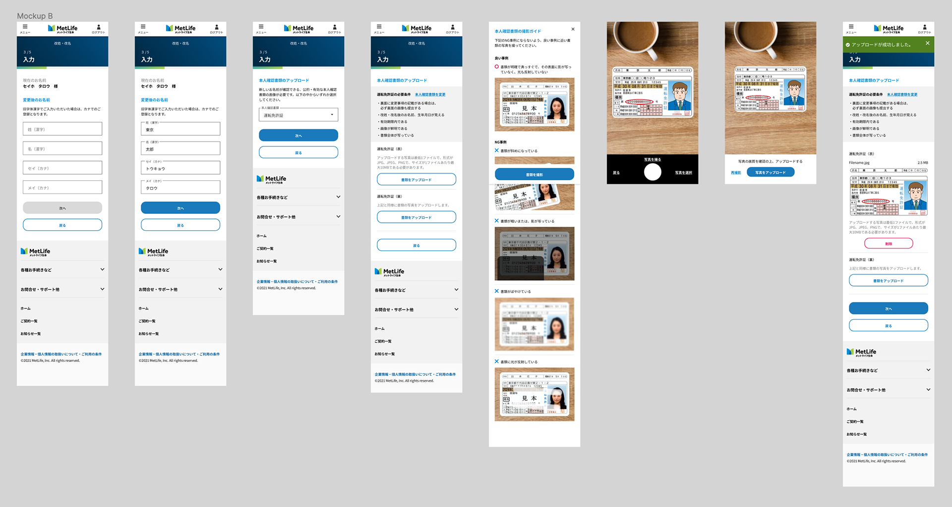
File Upload Improvement
Customers need to upload their documents for authentication during onboarding or making a claim. However, there are many requirements for uploading documents that customers tend to miss.
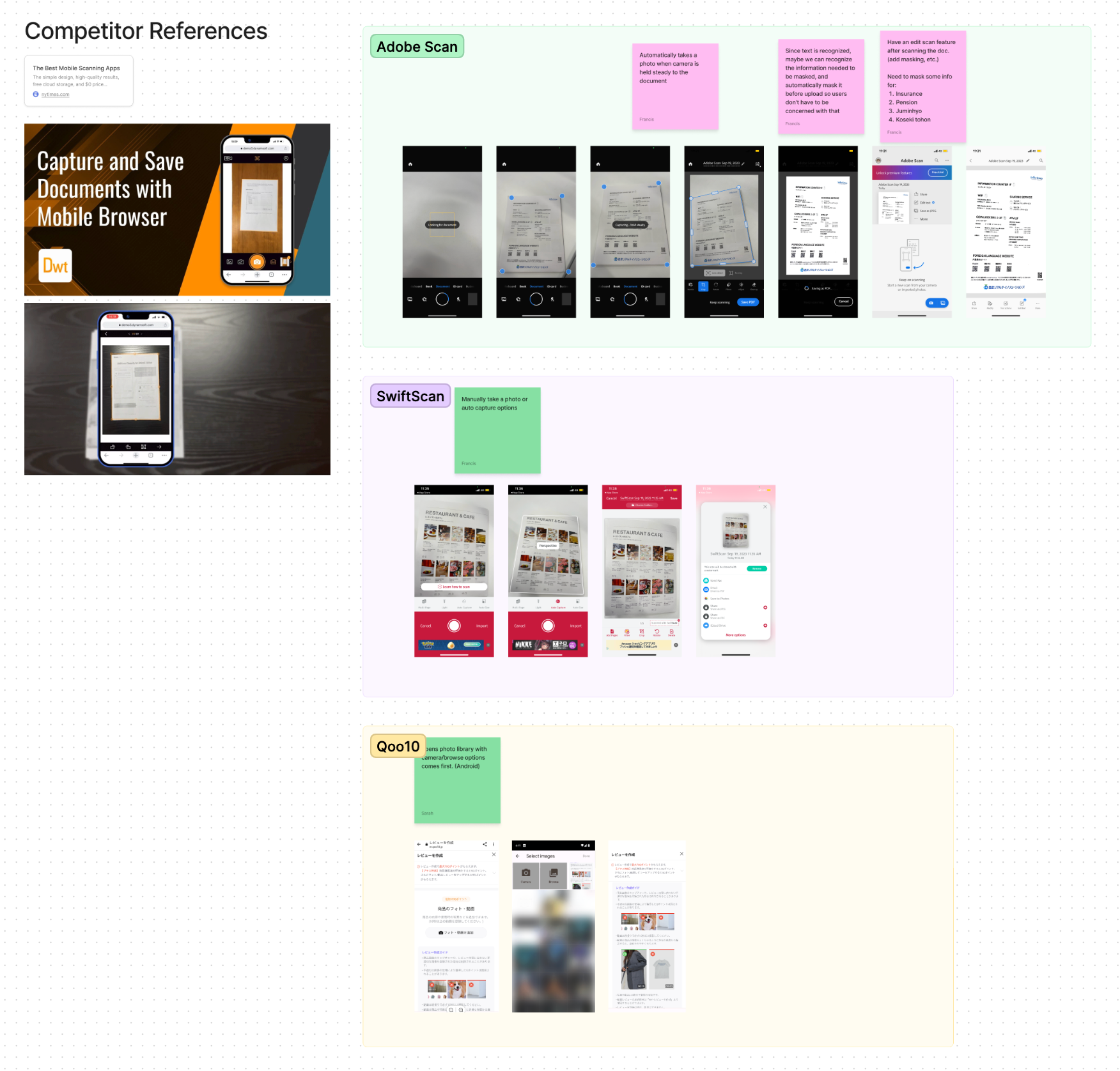
Competitor Analysis of File Upload Flows
I did an analysis of how other apps solve this problem and found that auto-detection and camera feed UI make the UX seamless. They guided the user using dynamic visual elements, as opposed to static instructions.
Improved File Upload Mockup
I proposed two solutions and applied a similar auto-detection and camera feed UI in Mockup A to guide the user. From usability testing, we found that this makes the flow clear and simple for majority of users and decided on Mockup A. In Mockup B, the article format made users think more and it was not effortless for them.