Overview
Rakuten Mobile is the top mobile virtual network operator with 16% share of the Japanese market as of March 2020. They aim to be competitive with other large providers in terms of the UX of their e-commerce, e-care and point of sale (POS) apps and websites.
概要
楽天モバイルは、2020年3月現在、日本市場で16%のシェアを誇るMVNOです。eCommerce、eケア、POSのアプリとウェブサイトのUXにおいて、他の大手プロバイダーと競争しています。
Objective
To increase conversion and retention rates of Rakuten Mobile users
目的
楽天モバイルユーザーのコンバージョン率と保持率を高めること
Outcomes
In a span of 3 months, 1 million users signed up for the service.
Within a year, the purchase conversion rate doubled.
Achieved Apple and Rakuten Mobile's satisfaction for smooth e-commerce release of iPhones.
結果
サービス契約申し込み数が3ヶ月以内に100万回線を突破しました。
1年以内にサービスの契約コンバージョン率が2倍増加しました。
iPhoneをスムーズにEコマースでリリースし、Appleと楽天モバイルの満足を得ました。
Deliverables
User testing reports, user surveys, mockups, prototypes,
Japanese translations for mobile web/app and desktop
成果物
ユーザーテストレポート、ユーザー調査、モックアップ、プロトタイプ、
モバイルWeb /アプリおよびデスクトップの日本語翻訳
Team Members
4 business analysts (BAs), 4 designers and 5 QA engineers (13 total)
チームメンバー
ビジネスアナリスト(BA)4名、デザイナー4名、QAエンジニア5名(合計13名)
Project Duration
1.5 years
期間
1年間半
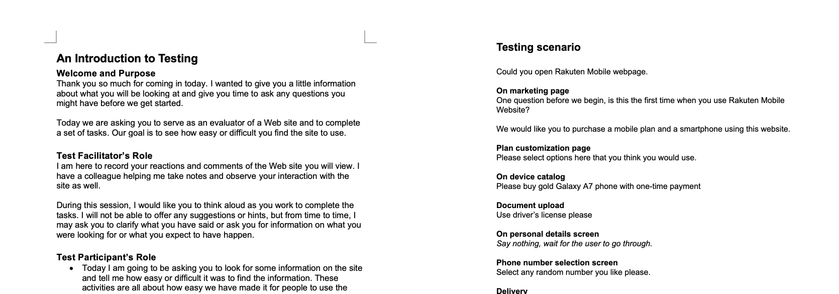
User Testing Script and Scenario
We prepared an introductory script to be read by me as the facilitator and the onboarding testing scenario for the testers to guide them. We were able to orient our testers through the testing process and go through each step of onboarding on our actual app to gain feedback from them.
ユーザーテストスクリプトとシナリオ
ファシリテーターとして私が読むための事前説明スクリプトと、テスターを案内するためのオンボーディングのテストシナリオを用意しました。テストプロセスにテスターを指導し、実際のアプリでオンボーディングの各ステップを実行し、フィードバックを得ることができました。
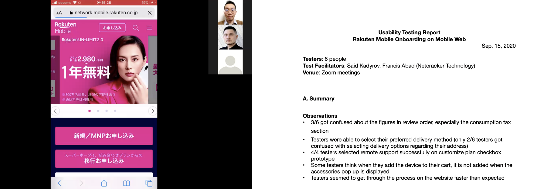
Results and Insights from User Testing
We learned that many users got confused with the figures in the review order screen and had trouble adding devices to their carts, after conducting 6 remote tests using Zoom. I kept video recordings of the sessions to refer to and summarized each session in a report afterwards. Using these insights, we decided to improve the eCom app as you can see below.
ユーザーテストの結果とインサイト
Zoomを使い、リモートテストを6回行ったところ、多くのユーザーが注文確認の画面の数字に戸惑い、カートにデバイスを追加するのに混乱していたことがわかりました。セッションの動画を参考として保存し、その後、各セッションをレポートにまとめました。 この習得事項 を活かし、下記eComアプリを改善しました。
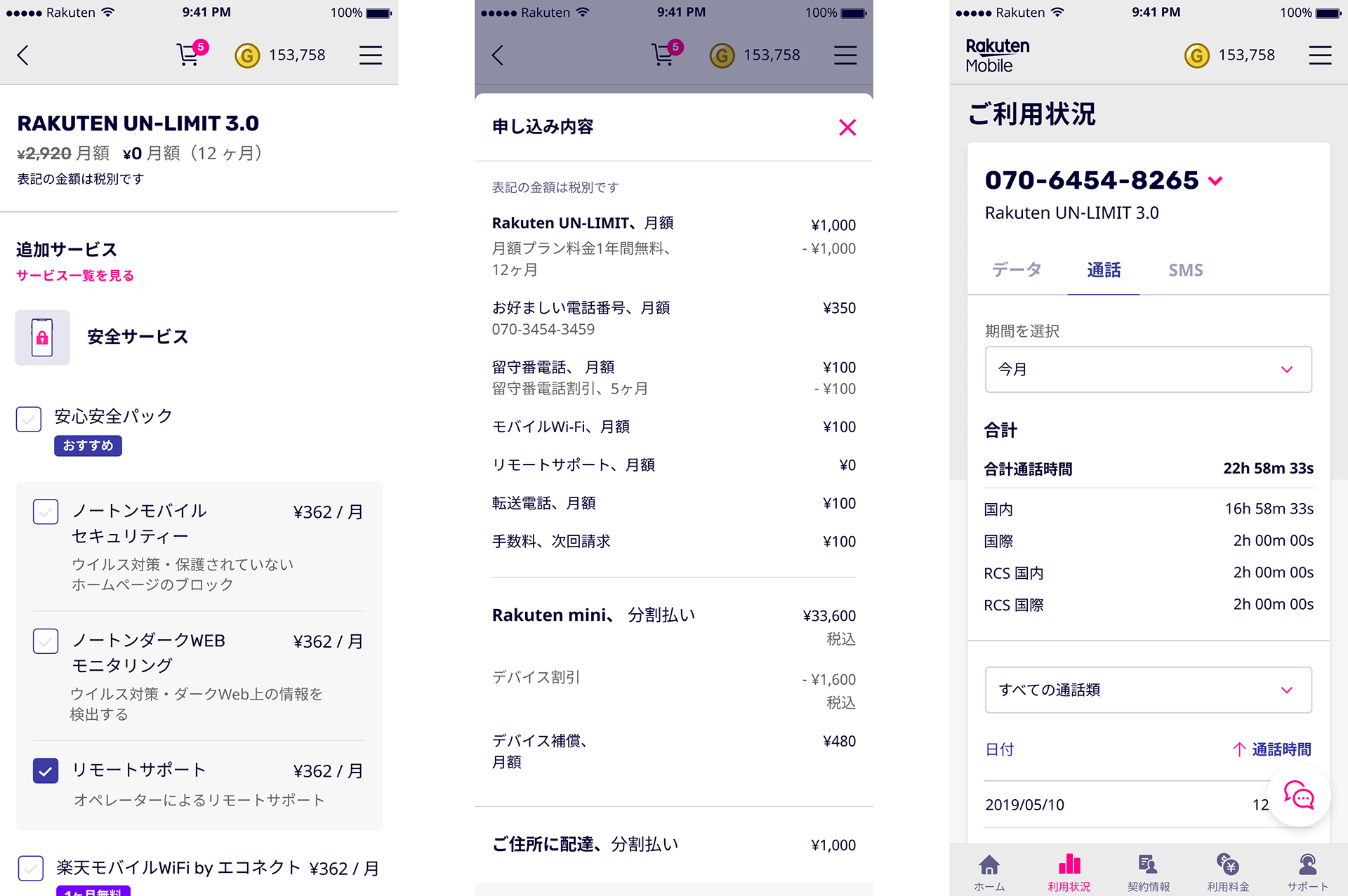
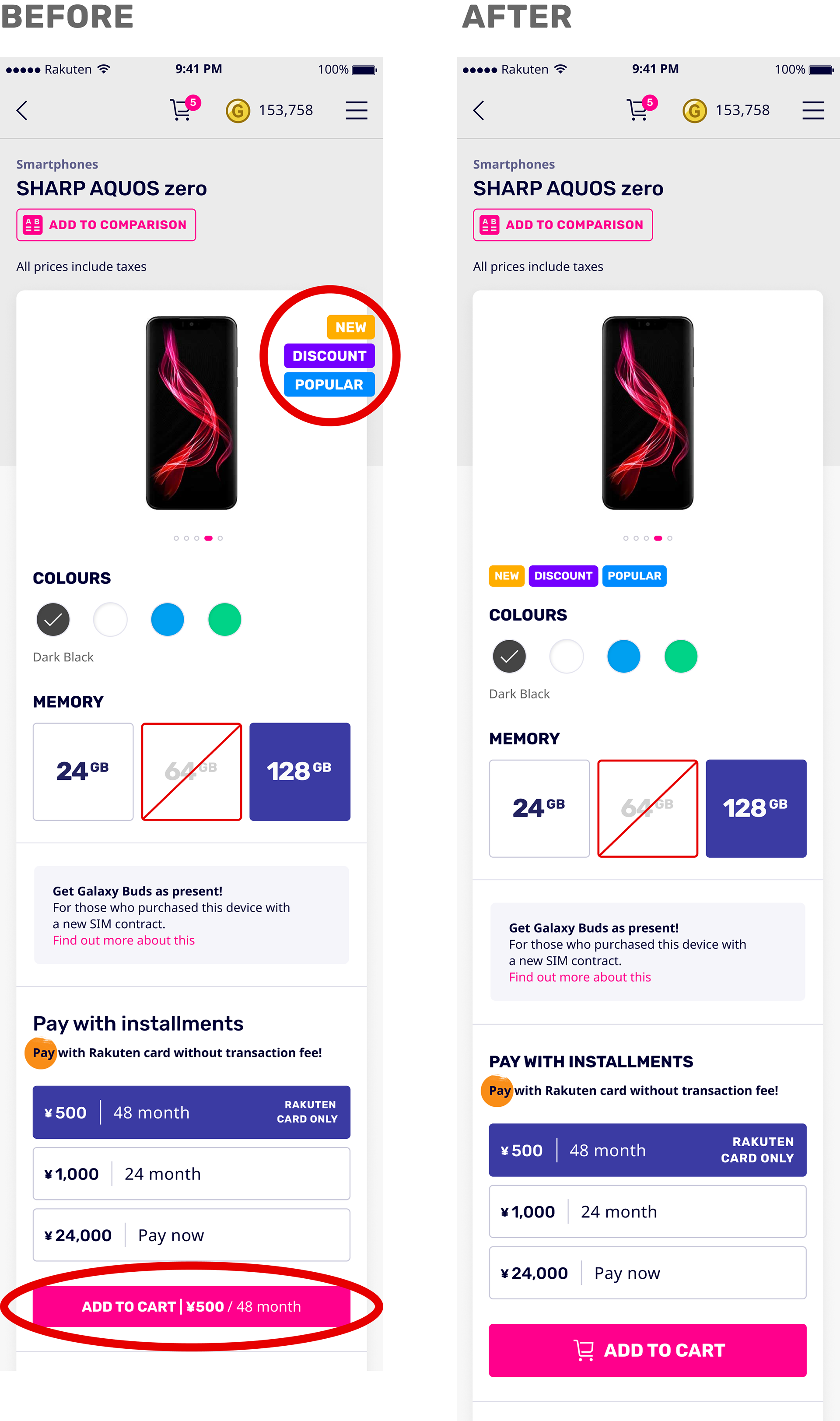
eCom Device Page Improvement
The device page had problems that many users couldn't see the categories of the devices and that the add to cart button was perceived as a banner and not tappable. We decided to put the labels aligned to the left with the details of the device, and add an icon, use concise wording and round the edges on the add to cart button to make it clearer for users.
eComデバイスページの改善
デバイスページには、多くのユーザーがデバイスのカテゴリを見ることができず、「カートに追加」ボタンがバナーとして間違えられ、タップできないという問題がありました。ラベルをデバイスの詳細に合わせて左側に配置することにしました。 アイコンを追加し、簡潔な表現に変え、「カートに追加」ボタンの端を丸め、ユーザーにとってわかりやすくしました。
Device Compensation Option Prototype
Many users do not avail of device compensation when buying a device. In order to encourage them, we put information whenever a user would remove device compensation to ensure that the user makes an informed decision. You can try removing it on the device page and also the edit order page and see the information in the prototype below.
デバイス補償オプションのプロトタイプ
多くのユーザーは、デバイスを購入するときにデバイス補償を利用しません。 それを提案するために、ユーザーがよく決めるように、ユーザーがデバイス補償を解除するたびに情報を提供しました。 以下のプロトタイプでデバイスページと注文編集ページで補償を解除し、情報を確認してみてください。
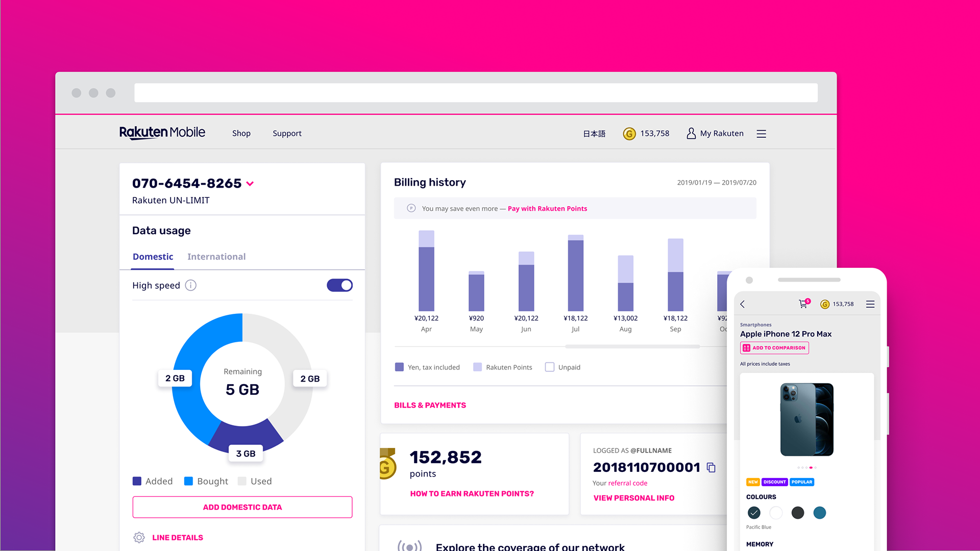
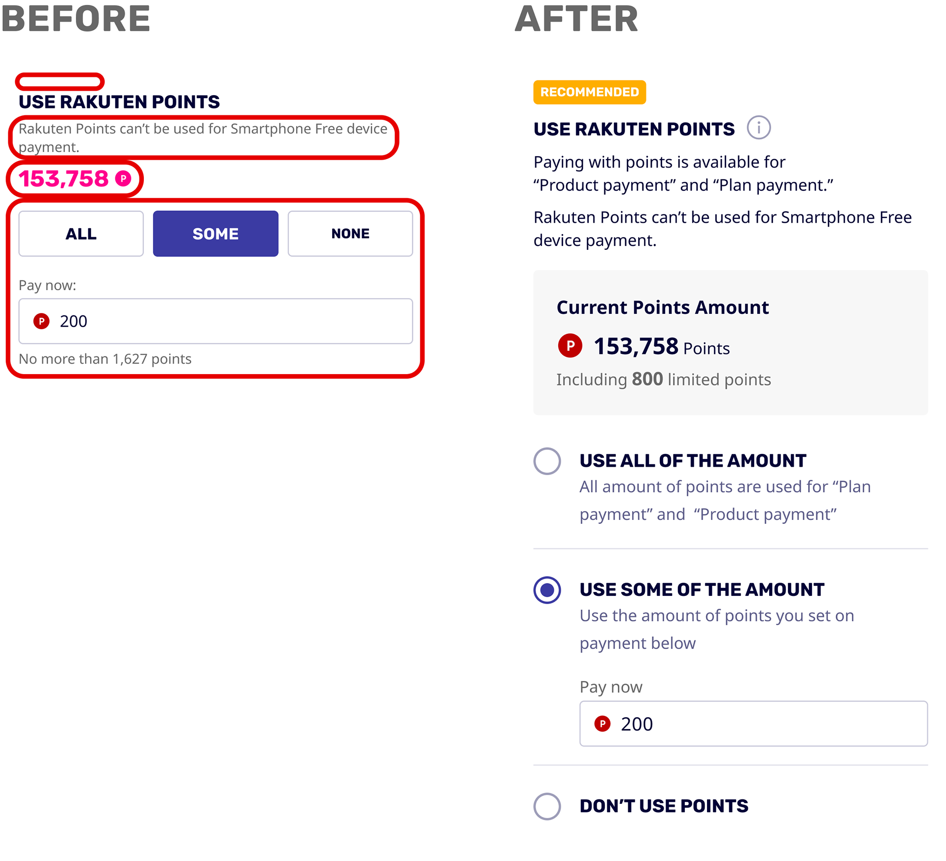
Promoting Rakuten Points Reward Program
In order to increase the conversion rate, especially with existing Rakuten Ichiba users, we needed to promote the use of Rakuten Points for device and plan payment. Previously, the Rakuten Points widget did not stand out and was not consistent with Ichiba branding and some users didn't think they could choose an option. We decided to highlight the widget as "Recommended," show the users' current points explicitly with Ichiba red, and use radio buttons to let the user decide on point usage.
楽天ポイントリワードプログラムの促進
特に既存の楽天市場ユーザーのコンバージョン率を上げるためには、デバイスやプランの支払いに楽天ポイントの利用を促進する必要がありました。 以前は、楽天ポイントウィジェットは目立たず、市場のブランディングと一致していなく、一部のユーザーはポイントを選択できるとは思っていませんでした。 ウィジェットを「おすすめ」で強調し、市場の赤でユーザーの現在のポイントを明らかに表示し、ラジオボタンを適用し、ユーザーがポイントの使用を選択できることにしました。
特に既存の楽天市場ユーザーのコンバージョン率を上げるためには、デバイスやプランの支払いに楽天ポイントの利用を促進する必要がありました。 以前は、楽天ポイントウィジェットは目立たず、市場のブランディングと一致していなく、一部のユーザーはポイントを選択できるとは思っていませんでした。 ウィジェットを「おすすめ」で強調し、市場の赤でユーザーの現在のポイントを明らかに表示し、ラジオボタンを適用し、ユーザーがポイントの使用を選択できることにしました。
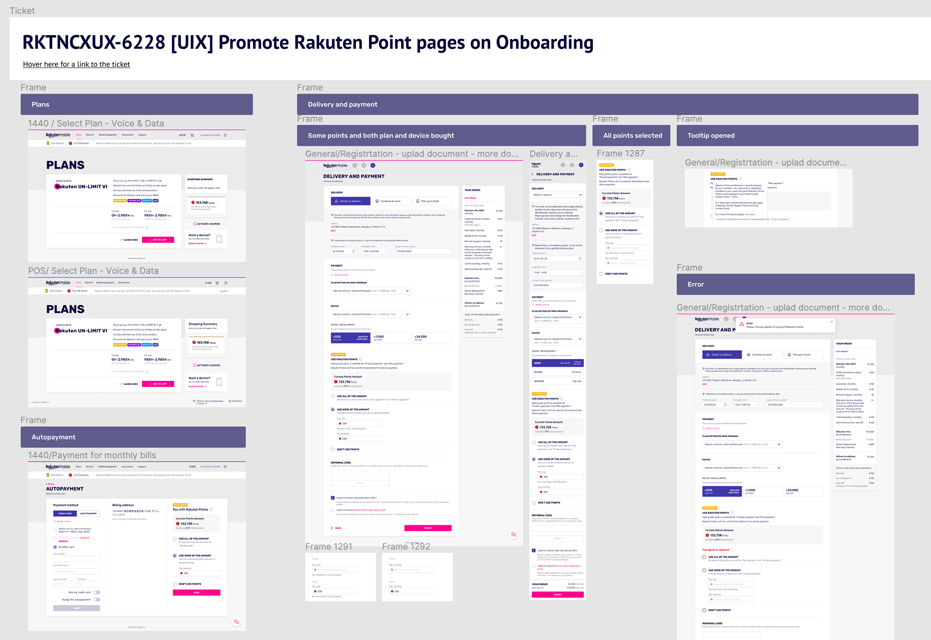
Applying the Promotion on Onboarding
We applied the promotion across onboarding screens on mobile and desktop, from when the user selects a plan, decides on delivery and payment before checkout, and autopayment for monthly bills.
オンボーディングにそのプロモーションを適用する
プランの選択、チェックアウト直前配送と支払いの詳細、毎月請求の自動支払いのステップ等、モバイルとデスクトップのオンボーディング画面全体にプロモーションを適用しました。
プランの選択、チェックアウト直前配送と支払いの詳細、毎月請求の自動支払いのステップ等、モバイルとデスクトップのオンボーディング画面全体にプロモーションを適用しました。
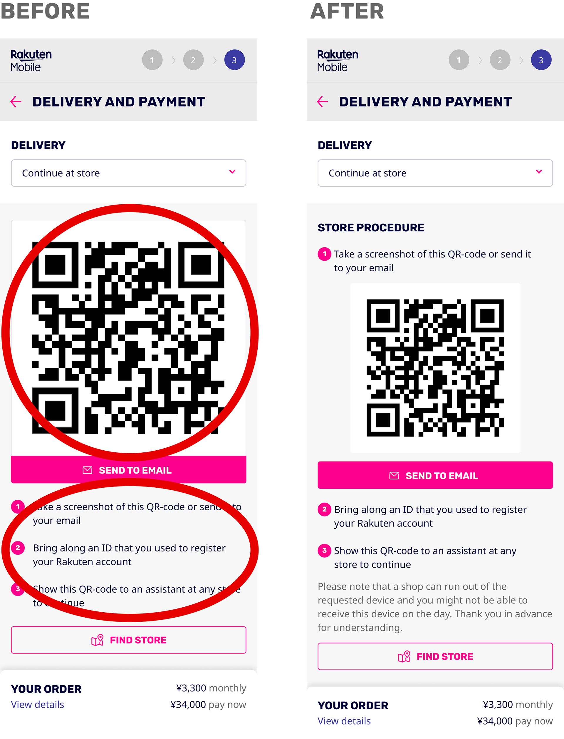
Instructions for Store Pick-up
Users can continue shopping at the store. Before, the QR code distracts from the unordered steps the user needs to take, so we decided to organize the steps with the QR code incorporated in it on the new screen.
店舗受け取りの手順
ユーザーは店で買い物を続けることができます。 以前はQRコードが大きすぎ、ユーザーが実行する手順が順序付けられていないため、新しい画面にQRコードを組み込んだ手順にしました。
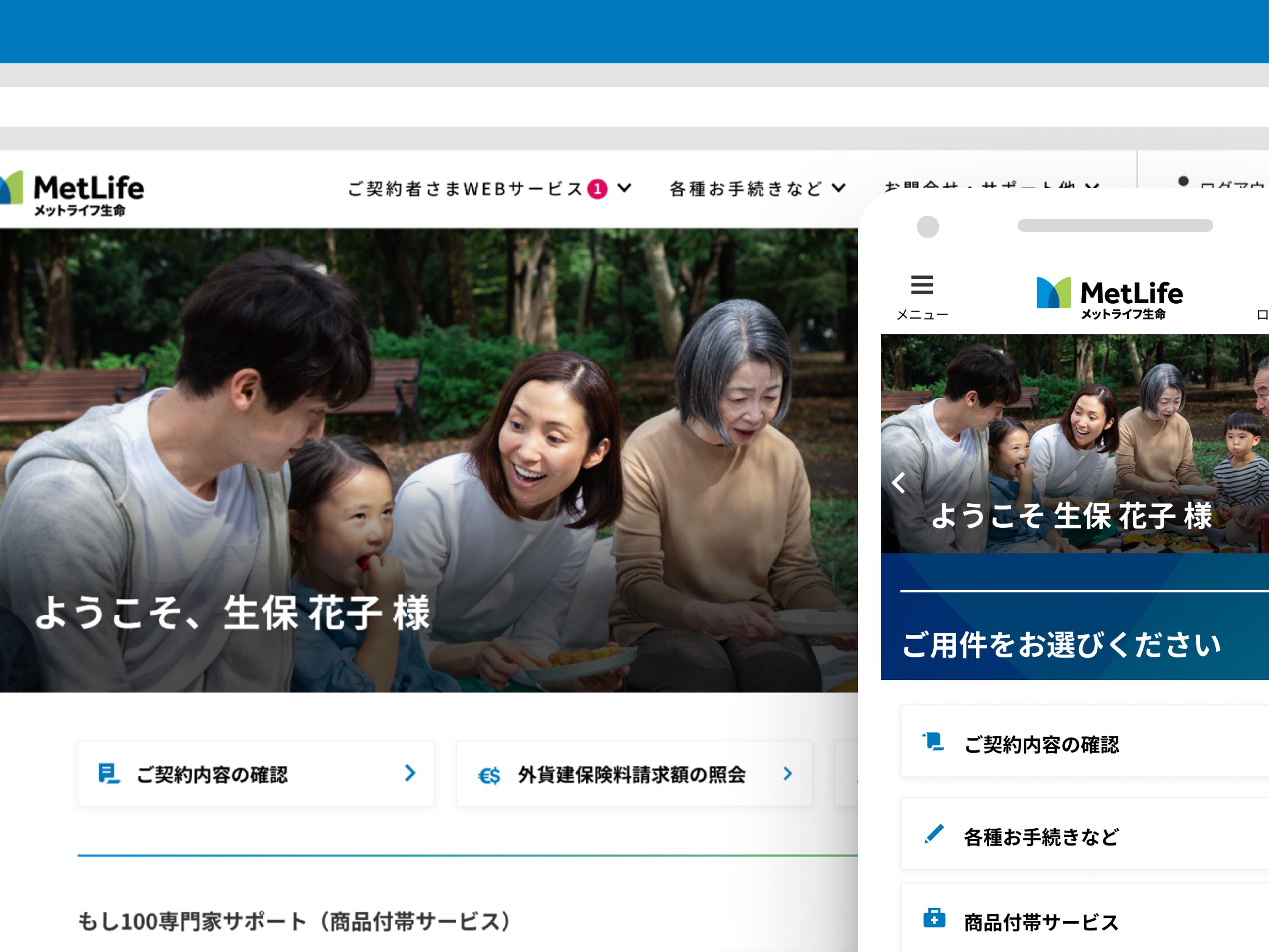
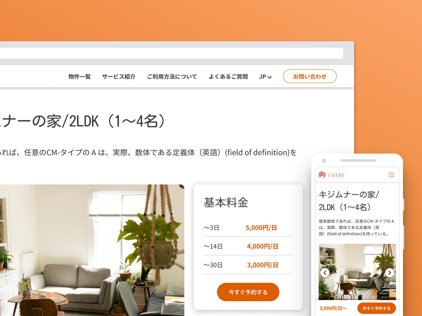
Japanese Localization
Since our clients and users are Japanese, we also localize the mockups. To maintain consistency with the whole product, we always check the text with our archive of Japanese translations. We also use tools like Google Translate and Search to find Japanese terms users would easily understand in this market.
日本語ローカリゼーション
クライアントとユーザーは日本人であるため、モックアップもローカライズしていました。 サービス全体の一貫性を維持するために、常に日本語画面のアーカイブでテキストをチェックしていました。 また、Google翻訳や検索等のツールを活用し、この市場でユーザーが簡単に理解できる用語を見つけました。